chatbooks
rebrand
2021
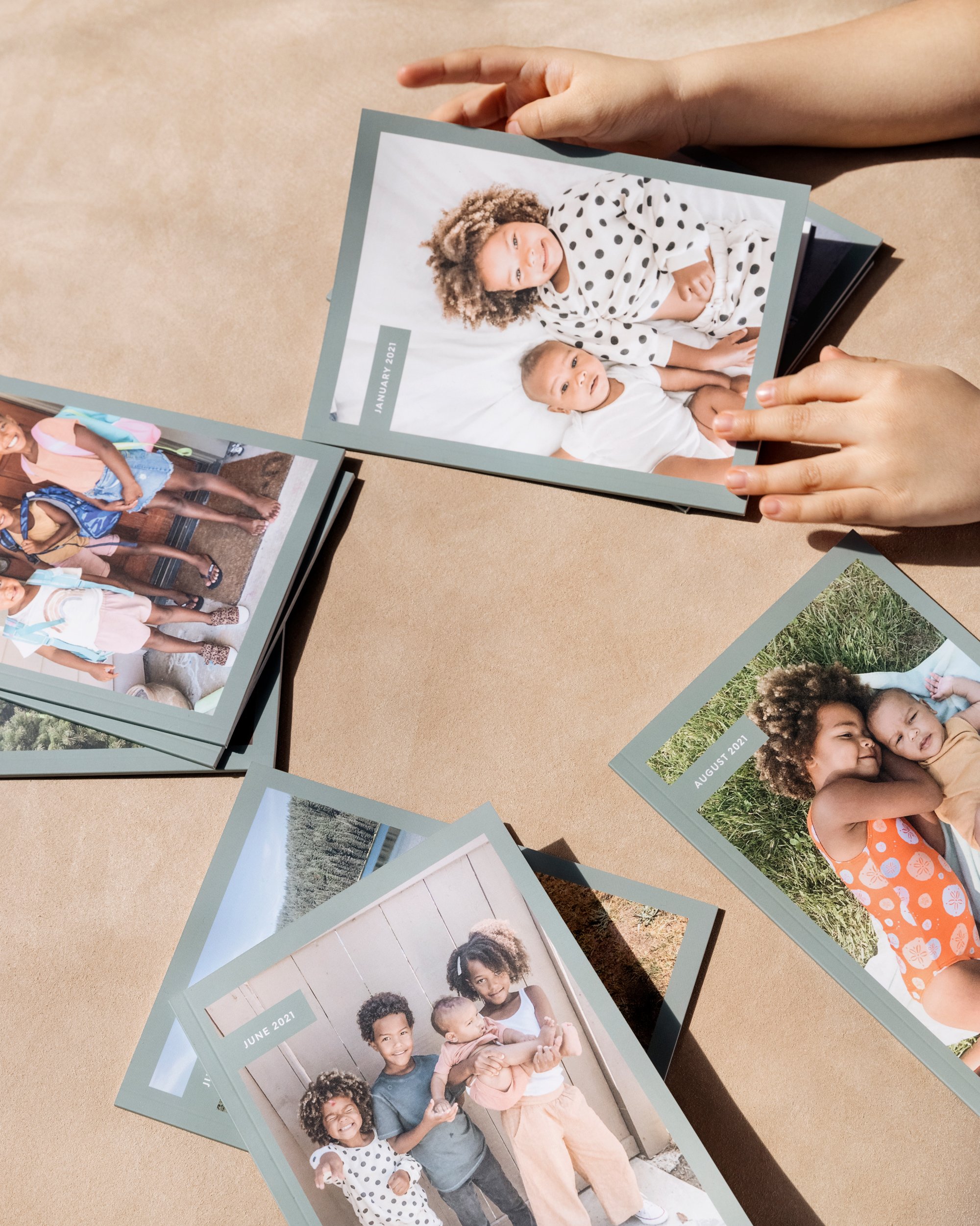
7-some years ago, a small team launched Chatbooks with a simple idea: make it beyond easy to print your family’s photos. Over the years, the products we sell — and the technology that powers them — has evolved. Along the same lines, we wanted our brand to continue to reflect the community we serve, and that meant it was time for a refresh. Just like our skinny jeans of 2014 have evolved into the mom jeans we’re trying out today, it was time to update our look while staying true to the DNA of our core brand elements.
Read the full story: Behind the Scenes

Step 1: Decide What to Refresh
A Brand is more than design and what people see visually—it includes our mission and how they feel when they interact with us. From their first touch point–whether that’s an ad, a meme on Instagram, or a website visit–to opening their first book, to receiving their 100 Club t-shirt, to the engagement with our founders—the look and feel is what makes us Chatbooks.


In this case, we wanted to change our logo, update our color palette, and add a new brand typeface. We also wanted to update our tagline to a mantra that would inspire both our team and our community.
You can read more about the new tagline from Chatbooks founders here).